One artist's journey

Friday, December 10, 2010

"You Are Here/I am"

 "You Are Here/I Am" First Year MFA show at first glance seemed quite interesting. The image of an interesting and exciting animal head spewing out a bloody substance like a fountain lingered with me in the few days before I really took a deeper look. However, as I went further and further into the gallery more questions than answers came to mind, more misunderstandings and confusions crept up from a place in my mind where things seemed without complete purpose. I was unsure of the artists' ideas, challenges, mindset, and yet I was also met with a certain understanding of contemporary art surrounded by the environment of Mason Gross. Most of the works spoke to me in a free-unabashed  way, but what left me unsatisfied was a type of disconnection. I felt as though many of the works did not fully address the observer or the gallery setting, and some did not seem completely resolved.

 A.P. Vague's work called "Closer to God" struck me in several ways. First the title turned me somewhat away from the work, though I am not sure why; maybe it was that I felt I would find someone in the midst of an extreme spiritual rebirth or journey, but as I moved in closer to the work, and began to examine further the details of the piece I found myself quite involved. I wanted to know more, to understand each word, written or typed on the pages surrounding me. I felt as if on a journey myself, learning and taking note of each clue I received into the artist or subject's world.
The work seemed quite personal and let me deeper into a place I had not known before, this intrigued me. The composition of the work also allowed me to feel as if I was on a sort of diary treasure hunt, or as if someone like Anne Frank's diary was on show and it was my time to really find out what happened. Mixing what looked like older papers with images, pieces coming off the pages of the book, overlapping and wiping out details of text, with two video screens seemingly strategically placed, I felt as though history was meeting the present. In a space of the subconscious or surreal reality of vacant images, I was reminded of the video artist Bill Viola, and his video, "The Passing". In most of his films he is searching for identity, tying into my reactions to the MFA piece. The only aspect of this piece that left me wanting was I felt there was no conclusion, no way truly into the piece and no way fully out, no feeling of resolve. I found myself going back to the piece over and over and searching for more, but each time not really getting what I wanted from it, not really gaining any truth, any information, any meaning, but only seeing again what I had seen before, wondering whether I would ever really understand.
 ___________________________

 Chris Camperchoioli's three paintings on the wall caught my eye immediately as I walked into the first room of the gallery. I felt quite drawn to the works, as though I was being sucked into a completely new dimension. These works seemed to be suggesting something coming in and out of existence. As I look deeper, I felt as if I was grasping something tangible just for a second, and then

the next minute it was lost. Use of materials appealed to me, and I found the difference in shape, color, mark all came together in united, yet unexpected ways. The worlds created by these paintings appear suspended in a deep void, though concrete in their existence and power. The only aspect that through me off as a viewer was the two blues of the last painting. I felt as though the colors could have been pushed further and that they did not seem to communicate the same feeling, purpose as the other color choices.

______________________________


 Rita DeAngelo's two works seemed to completely contradict each other. I thought the big painting worked tremendously well and communicated a new and awkwardly rewarding space. However, the smaller work to the left gave me nothing except a certain distaste for the quality of the work. The smaller work entitled, "5.22.2004-5.24.2004", lacked purpose, lacked focus, and conveyed a lack of depth. As soon as I looked at the smaller piece I immediately wanted to see less of it, felt as though it took on little presence compared to the other works in gallery. The size felt arbitrary and the pieces of caulk and plexiglas seemed slapped together with little thought.
The large piece spoke to me much more through the color, application, line, form, and composition. The scale, mark, contrasting marks create a layered affect that illuminated a new space involving a figure/ground relationship. The large pink shape seems to be covering something up, forcing the viewer to be confronted with the engulfing space. The outer border becomes a sort of frame, however, the pink extends to the edge of the canvas, breaking the boundaries and allowing a passage in and out of the painting.


____________________________


In entirety the first year MFA show examined many contemporary aspects, but they were not all together clear. Many works did speak to a certain exploration into the medium with which the artist was using which I found to be quite interesting and exciting. Although a further development of ideas and use of materials, composition, and presentation present themselves to me as beneficial. 

Monday, November 22, 2010

Studio Journal: Questions I Am Asking Myself

What does a contemporary cave painting look like today?
Do I create that? What compels me to create works that reference this old writing of the past, old slabs, caves, earth, dirt, cracks, scratches, symbols?
what other artists are working on the same ideas? or grappling with ideas of contemporary culture, contemporary life-style, how the planet is being taken care of, how people are reacting to all different types of scenarios today?
I would like to constantly be reading, searching for new source material, artists, articles, books, thoughts, ideas, references.

"Knowledge is power: the more you know the better choice you make"
-Barb Madsen

Notes:
Progress
Never Finished, always in progress
the nature of order, limitless, subconscious
self-finding self
individual
unique
is the end result the most decisive part of the process?
synapses of the brain
mysterious quality
prehistoric art
what is your intent?
Outsider Art
Flipped through, "Inner worlds outside'
book about Outsider Art.

all over image vs. having a definite focus?

Saturday, November 20, 2010

Studio Journal: Looking to Gorky

Arshile Gorky's paintings have recently become my foundation for the research about my subject matter and painting style.

His use of line, shape, color, brushstroke, thickness, and composition greatly inform my work.
I feel that his work really touches on his sense of the world around him during his time. My sense of the world is a heavy influence in my own work--being able to connect Gorky's subject matter and tone with his use of mark and paint inspired me in more than one way.

Gorky, Agony I saw this painting in a book in the Art Library as I was skimming books on Gorky. Agony stuck out to me not only for its color and richness, but also for its complex composition and the emotion reaction that I felt as I turned the page and saw it. I could not keep my eyes away and I had a hard time moving past it.

The daring gestural mark and strong emphasis on this spontaneous looking arrangement of shapes creates an atmosphere, much like the one I am searching for

Friday, November 19, 2010

Studio Journal: Trip to Chelsea Galleries

Going into Chelsea twice within three weeks of each trip allowed me to feel much more connected to the art scene in New York.

I found work that truly spoke to the dialogue that is occurring each day for me.

 Angelina Gualdoni - Aysa Geisberg Gallery

I found Gualdoni's paintings to be very interesting and intriguing. There are many subtleties to the paintings that make them even more appealing to me, and I found that it was the strong marks colliding with the more passive subdued marks that created a layered image. This effect, this quality of the paint, of the surface, of the subject matter, caused me to question where my own subject and techniques arise from. 


Tracey Emin and Louise Bourgeois - Caroline Nitsch Gallery

These works on paper as a collaboration between Louise Bourgeois and Tracey Emin suggest ideas about abandonment, betrayal, lust, depravity, birth, and death.

Tracey Emin, in particular, with her use of text, line drawing, and gouache speaks to a very personal narrative surrounding gender, confrontation,  and vulnerability. These drawings were in "response" to Louise Bourgeois’ drawings, which I find to be a very interesting motivation and challenge in itself. How does one artist relate to another, while using their particular vehicle for making work. The vehicle for Tracey Emin's works was also something that I was looking at.

How does her use of writing, thin, simple line, figures, and sexual references speak to her subject matter and the messages she wants to bring forth with her work.

Wednesday, November 17, 2010

Studio Journal: William Kentridge Show, Boston, MA

Informing my sugar lifts in the previous post was the William Kentridge show at Mass Art in Mass.


Kentridge's prints speak to a free and strongly passionate need to create art. As I look at them, I feel compelled to want to express myself, seeing how his techniques can create an image that also works well with my own ideas.
The textures, strong lines, intense passages of multiple printmaking techniques create a whole world of surfaces, surroundings, and depth. My sugar lifts are abstract, but are based on an urge to create a dark strong powerful line, like those in Kentridge's pieces.

Studio Journal: Using Printmaking to Inform My Paintings

While I have not been able to fit in enough classes to have a printmaking and painting double concentration, I am committed to taking as many printmaking classes as I can. I really find that printmaking and painting are linking, in quite different ways that I would have expected when I first started printmaking, but now I find that my ideas can develop differently, turn in different directions, and can be totally new in a print.

Often times printmaking does not seem to work the same way for ideas in paint. Print is a very structured medium, often a lengthy process, where less can be spontaneous and intuitive. However, I have tried to the fullest degree to incorporate my painting style, such as a lack of drawing before hand, lack of necessary logical thinking, into my prints. It has not come so easy, but I have not given up.

Most recently I have been working on sugar lifts, which are a process in which one takes a mixture of sugar syrup and soap, applies it to a zinc plate and performs many steps to etch the sugary substance into the plate. When it is inked, the parts where the sugar was painted on will print black, as a form of intaglio.

Saturday, October 2, 2010

Studio Journal: An Abstract World

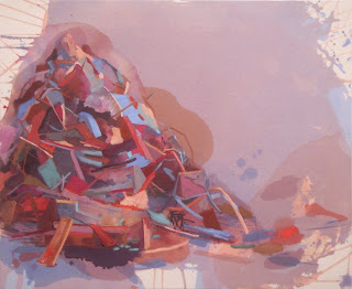
This first painting started off the new series of the semester.

Over the course of 6-8 hours, I began to layer paint on the surface of a blank canvas. Each successive layer did not feel adequate; I was constantly struggling with ideas of space, composition, mark, and color. Many intuitive comments on my work from other people as well as myself, created a layering of paintings that ultimately became a rather flat surface.

At the moment of complete clarity, the moment of recognition with the painting's surface, the colors, the composition, the space and the mark, I was alone in the studio, with no sound and no distraction. Within 20 minutes I had created and finished this final layer of the painting. My mind and body had arrived at a complete meditative state, understanding completely and wholly what my purpose was. This is the same state I seek to reach in my other successive paintings, working layer by layer until my mind settles and releases the tension of the surrounding world.

I am thinking also about time and the human concept of living. I apply paint, thin in some areas and thick in others, suggesting a dichotomy within life, within painting. Often, the thinner surface has a blended quality, reminding myself of the essence of a blurry photograph-referencing time, space, and movement. The thicker paint applied on top is heavy with presence. Scratched marks back into the canvas reference a primitive, intuitive gesture, unearthed by my unconscious. A feeling of immense energy exudes the slashes, the strong curves, and the harsh vibrating cross-hatching, fence-like motif. Light emerges from behind the colors, deep back in space, peaking out with hesitant force.

Influenced greatly by Pat Steir.